Data Visualization analyzing 100 years of July weather data for Tucson Arizona. Data is sourced from weather.gov

All in dataviz
Data Visualization analyzing 100 years of July weather data for Tucson Arizona. Data is sourced from weather.gov
Since 1964 Germany, Austria and Italy have claimed nearly 85% of all Men's Luge Singles medals in the Winter Olympics. Explore the historical finish rankings in this #SportsVizSunday
I’ve long since desired to produce a more modern remake of a church liturgical calendar that displays the historically observed seasons of the year and key dates of worship. With some heavy use of the Figma arc tool, plus a sunburst chart in Tableau, and a bit of layering, I was able to create the calendar shown here.
Creating a visual resume using tableau is a fun and easy way to showcase your skills and stand out among other applicants. This post walks through a few templates that can be used to begin to construct your own visual resume.
This week’s #MakeoverMonday focuses on a chart by howmuch.net visualizing US purchasing price parity by region. I used a connected strip plot to highlight the regional differences and the changes over time. Enjoy!
The airline industry was one of the hardest industry’s hit by the COVID-19 pandemic. This visualization compares domestic air travel routes for several major US airlines for the month’s of April 2019 and 2020
Have you ever wondered what it was like competing in Iron Viz? In this post, Christian shares some of the things he learned along the way as a finalist and wished he would have known earlier. The intent here is to give aspiring Iron Viz finalists with some key things to consider and work on as they pursue data viz glory in next year's competition.
Some reflections on my process participating in IronViz, the world’s largest data visualization competition.
I recently had an opportunity to collaborate with Tableau Zen Master Kevin Flerlage (www.flerlagetwins.com) on a visualization project involving Old Testament biblical prophecies and their New Testament fulfillment. It was great to work with Kevin and learn from him, and I’m really proud of our end product. Here’s a bit of insight into what it took us to get there.
There are seven key principles of design: Balance, Contrast, Emphasis, Movement, Pattern, Rhythm, and Unity. In this guest blog post, David Borczuk explains how he used each of these design principles to make the week 7, Makeover Monday (MoM) submission:
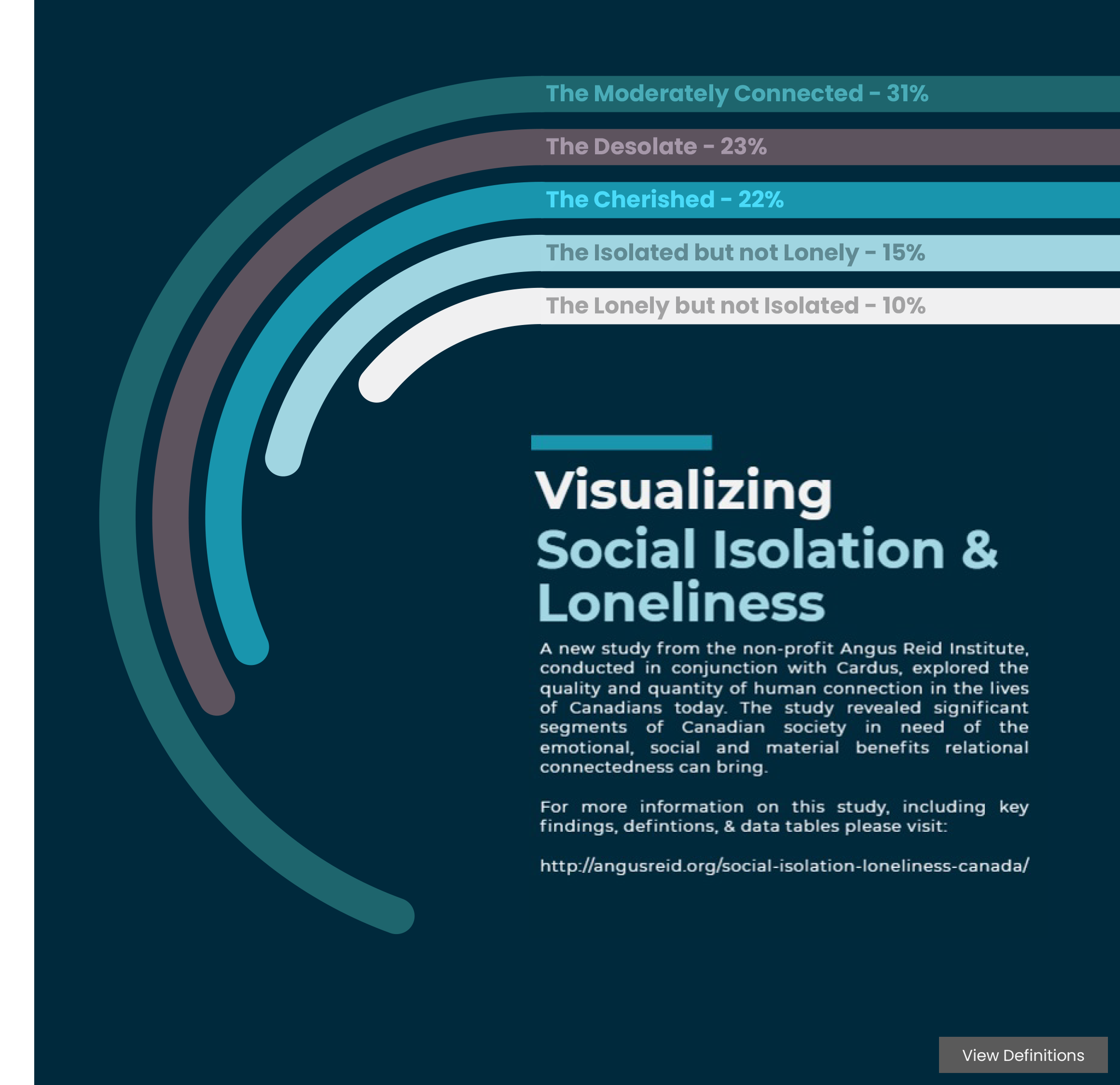
A study from the non-profit Angus Reid Institute, conducted in conjunction with Cardus, explored the quality and quantity of human connection in the lives of Canadians. The study revealed significant segments of Canadian society in need of the emotional, social and material benefits relational connectedness can bring.
Few things have shaped place, culture and existence like religion over the course of the centuries. December’s Throwback Thursday data set provided a great opportunity to see how the geography of religion has dramatically shifted over the last half century or so.
Parameter Actions and Viz Animations introduce powerful new possibilities to help practitioners guide viewers to the key data stories told through their viz. Here’s how I used those features to accomplish that using the October Project Health Viz data set on Autism.