
US Price Parity
The Original…

The original chart produced by howmuch.net can be found here: https://howmuch.net/articles/regional-price-parities-by-state
My Revision…

https://public.tableau.com/profile/thecfelix#!/vizhome/MakeoverMondayW17USPriceParities/MakeoverMondayW17USPriceParity
My Thoughts…
The original chart works to highlight the highest and lowest states in terms of Regional PPP, but it makes it hard to understand how PPP tends to cluster regionally and persist over time.
Moreover, the circular nature of the chart (circular stacked, diverging, dot-plot?) makes it challenging to compare states to one another unless their scores are numerically close together.
My Goals…
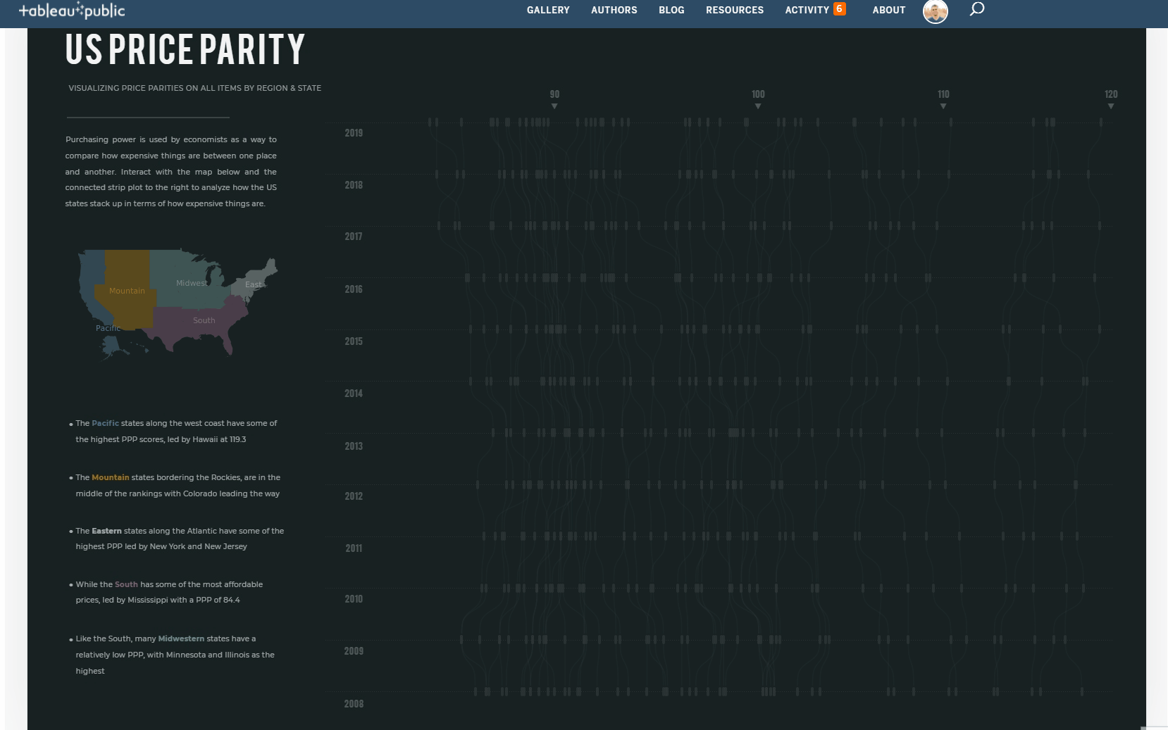
My goal for the viz was to highlight the PPP differences between coastal states and central/southern states using a storytelling approach, while also allowing for exploration of the viz and interactivity.
My Inspiration…
I’ve long admired the visualization shown below by Shan Carter and Mike Bostock…

https://archive.nytimes.com/www.nytimes.com/interactive/2012/10/15/us/politics/swing-history.html
Each row in their visual represents a presidential election, and the horizontal axis reflects the margin of victory for that political party. As you scroll down, you can see how much (or little) a state has changed over time. It’s a cool viz…functional and beautiful, and really pretty amazing considering it was developed over 8 years ago.
The viz takes a storytelling approach by allowing the viewer to ‘Highlight Tossups’ and ‘Highlight Ohio’, and view the associated data, while also allowing the user to explore a state of their choosing.
My Visualization…
Like Bostock and Carter’s viz, I wanted mine to be somewhat guided, but also allow for exploration. By clicking within a region, a user can highlight all states within the region, and see the regional clustering for PPP. A user can also hover over any one of the observations in the strip plot to understand where that state lies in relation to the other states, and how that state has changed over time.
https://public.tableau.com/profile/thecfelix#!/vizhome/MakeoverMondayW17USPriceParities/MakeoverMondayW17USPriceParity
Starting with a good Projection
To produce the US map I grabbed a US cartographic boundary shapefile from census.gov, dropped the files into mapshaper, entered a single line of code in the console, and then exported a US Albers projection of the United States:
The exported shapefile from mapshaper containing the US State geometries was then joined to the PPP data to create the map.

Regions were easily created based on the states using the Create from feature within the edit data source window in Tableau…

The steps to then create the map were pretty straightforward and are shown below…
When using alternate map projections it is critical to ensure that underlying map layers are unchecked
In addition to the map layers, I typically like to ensure that the Map Options allowing for ‘Pan and Zoom’ and ‘Map Search’ are also un-checked. There are times when the Pan and Zoom and search are useful, but when the map is being used primarily as a color legend and for user navigation (as in this case), this functionality is not needed and can be removed.
Unchecking Pan and Zoom helps prevent inadvertant user zooming
Creating the Connected Strip Plot / Vertical Bump Chart
A pretty basic prep flow was used to create the data set. The prep flow and associated files can be found here
The main steps of the prep flow were pivoting the data, sorting/ranking, densifying, and creating calculated fields to be used in the visualization
Once the prep flow is run, the connected strip plot can be created quite easily with a single sheet by following the steps below:
Create a Calculated Field: X…
IF [Year] = 2008 AND [T] > -5.5 THEN NULL ELSE [T] END
Create a Calculated Field: Y…
[Min]+
(1/(1+EXP(-[T])))*([Max]-[Min])
Then with Order and Year on the Rows shelf, and State on the Detail property of the Marks Card, drag X to Rows and Y to Columns. Ensure they are both continuous dimensions, and then reverse the Axis…
And voila… we have something that is beginning to look functional
Now that we have the lines, we can create the dots/strips; for this, I decided to use a custom shape. I created a very basic rounded vertical rectangle in powerpoint and then brought it into my tableau repository. We are almost ready to use the shape, but first a calculated field…
called last…
[X]=-5.5
…and then some preparatory formatting…
…and now we’re ready to create the dual synchronized axis and use the last field that we just created to tie it all together:

Add in a couple of set actions to control the coloring of the viz and that just about does it. Thanks for reading!


