Data Visualization analyzing 100 years of July weather data for Tucson Arizona. Data is sourced from weather.gov

Data Visualization analyzing 100 years of July weather data for Tucson Arizona. Data is sourced from weather.gov
The Men’s College World Series takes place each June in Omaha, Nebraska; it is the culmination of the baseball version of March Madness. It starts with 64 teams, and eventually pairs down to 8 teams who participate in a double elimination tournament. I love the tournament! It’s fantastic baseball, and it’s also really fun to visualize. Check out the visual history here, spanning from 1947 through this year.
Since 1964 Germany, Austria and Italy have claimed nearly 85% of all Men's Luge Singles medals in the Winter Olympics. Explore the historical finish rankings in this #SportsVizSunday
I’ve long since desired to produce a more modern remake of a church liturgical calendar that displays the historically observed seasons of the year and key dates of worship. With some heavy use of the Figma arc tool, plus a sunburst chart in Tableau, and a bit of layering, I was able to create the calendar shown here.
Creating a visual resume using tableau is a fun and easy way to showcase your skills and stand out among other applicants. This post walks through a few templates that can be used to begin to construct your own visual resume.
This week’s #MakeoverMonday focuses on a chart by howmuch.net visualizing US purchasing price parity by region. I used a connected strip plot to highlight the regional differences and the changes over time. Enjoy!
The airline industry was one of the hardest industry’s hit by the COVID-19 pandemic. This visualization compares domestic air travel routes for several major US airlines for the month’s of April 2019 and 2020
A Computer Vision System was developed to distinguish seven different registered varieties of dry beans with similar features. This #MakeoverMonday visualization focuses on the results of that classifier and visualizing the differences between the bean varieties.
A #MakeoverMonday visualization looking at the collapse of UK Exports in January due to Brexit
An invisible reference line can be used for many different purposes within Tableau. For example, they can be used to ‘fix’ an axis based on a user selection, to add additional space to a chart for labeling, and in this post, I step through how I used an invisible reference line to create a visual effect in my #IronViz Dashboard.
Day 16 of the #30DayMapChallenge is Islands, and I’m visualizing just a few aspects of the American offensive in WWII on the tiny and remote Pacific Island of Peleliu
Have you ever wondered what it was like competing in Iron Viz? In this post, Christian shares some of the things he learned along the way as a finalist and wished he would have known earlier. The intent here is to give aspiring Iron Viz finalists with some key things to consider and work on as they pursue data viz glory in next year's competition.
Tableau’s spatial functions make it easy to create dynamic leader lines for small polygon map labels. This is just a quick post that demonstrates how to create them and how they can be used to add clarity to your visualization.
Some reflections on my process participating in IronViz, the world’s largest data visualization competition.
My IronViz entry explores the influence of Social Capital on COVID-19
I recently had an opportunity to collaborate with Tableau Zen Master Kevin Flerlage (www.flerlagetwins.com) on a visualization project involving Old Testament biblical prophecies and their New Testament fulfillment. It was great to work with Kevin and learn from him, and I’m really proud of our end product. Here’s a bit of insight into what it took us to get there.
This data viz employs several different methods of measuring change to better understand how individual counties are flattening the curve and are continuing to keep it flat.
The New York Times graphics team has been doing an incredible job of providing the public with data resources to help them better understand the pandemic. This post covers the impetus for re-creating their county case map using a dot-density map.
There are seven key principles of design: Balance, Contrast, Emphasis, Movement, Pattern, Rhythm, and Unity. In this guest blog post, David Borczuk explains how he used each of these design principles to make the week 7, Makeover Monday (MoM) submission:
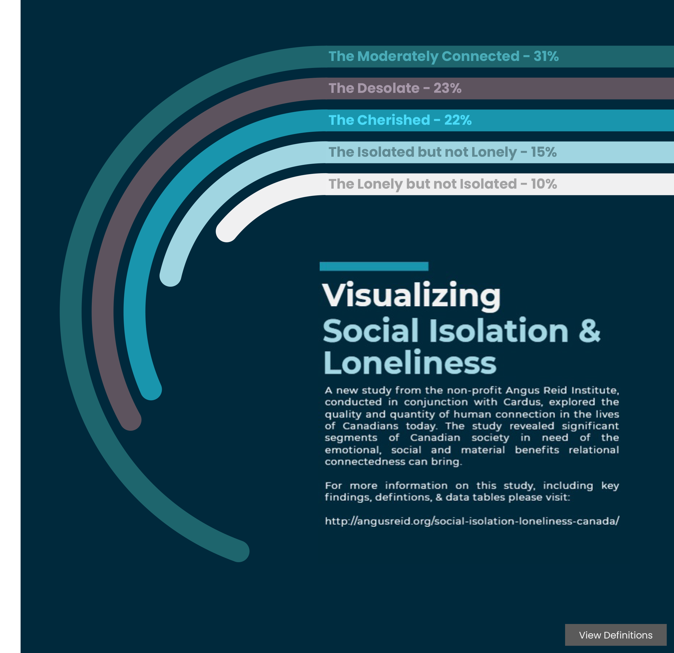
A study from the non-profit Angus Reid Institute, conducted in conjunction with Cardus, explored the quality and quantity of human connection in the lives of Canadians. The study revealed significant segments of Canadian society in need of the emotional, social and material benefits relational connectedness can bring.