
Reflections on IronViz
For this year’s IronViz entry I explored the correlation between American Social Capital and COVID-19. It’s a fascinating subject, and there has been some really great research on the topic over the last several months. My work on this visualization was really intended to be a visual exploration of that research, with the hope of simply adding something of value to the conversation.
Seeing how this was the first time I participated in IronViz, and at this juncture, we find ourselves squarely between the submission deadline and the announcement of the results, I figured it would be appropriate to capture some of my thoughts and reflections.
Life Happens. Adjust Accordingly.
The contest opened up on June 30, 2020, which ideally gave you over a month to ideate, research, plan, develop, tweak, and then finalize prior to meeting the August 4th deadline. HOWEVER, we all know 2020 has proven to be anything but ideal. This year has been all about bringing agility and flexibility to every process, and for me, IronViz was no different.
What do I mean by that?
Our family moved in mid-June, so late June and early July found us still unpacking and getting settled, while late July found me in the thick of work deadlines and presentation prep. Nonetheless, IronViz is the biggest data visualization competition in the world, and one of my goals for the year was to at least participate and give it a shot.
On July 28th, Sarah Bartlett gave a great presentation to the Tucson Tableau User Group where she recounted her IronViz process from last year’s feeder where she didn’t start until the final weekend. I also remember Chris Love tweeting about ‘the long’ IronViz weekend…
These things gave me a bit of hope that although I could not dedicate the span of time that I would have desired, I need not despair. Others have gone before me and successfully completed their entries within a similar amount of time that I was constrained to.
The other thing that I thought might work in my favor was that I had a concept that I was pretty interested in understanding better and was pretty passionate about, and I thought might naturally come to life through data visualization. My desire was to look at the mental/emotional health impact of urban greenspace.
Why?
Our own little community on the outskirts of Tucson is blessed with a public domain community orchard that throughout this pandemic season we have frequented together as a family and enjoyed time outside of the confines of our home and among the fruit trees of the orchard. The orchard has so many different varieties of trees (figs, pomegranates, apples, peaches, pears, plums, quince, grapefruit) that no matter what time of year you visit, there is almost always something in season needing to be picked.


The simple act of getting outdoors, walking or riding a bike, and harvesting some fruit helped us fill our fridge, but also helped us relieve some of the daily stresses associated with working from home and multi-tasking. It turns out, that many others also have shared the same experiences, so much so that the mental and emotional health benefits associated with urban green space, gardens, orchards, and parks is actually a fairly well-researched phenomenon:
Exploration of Greenspace and Mental Health in Melbourne (Casey, James, Cushing)
University of Illinois Landscape and Human Health Laboratory (Kuo)
I didn’t know exactly where I was going to go with it, but I knew it would involve some maps, so one week prior to the deadline I reached out to Adi McCrea…

Over the next couple of days I researched, found some great data sets, traversed some rabbit holes, but ultimately was stopped in my tracks when I came across the following two unrelated maps:
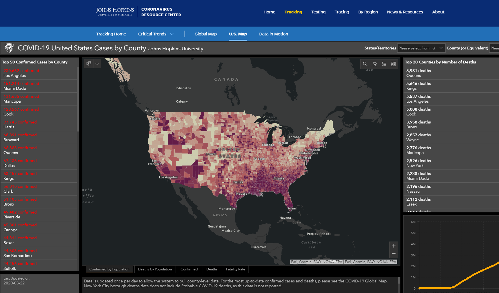
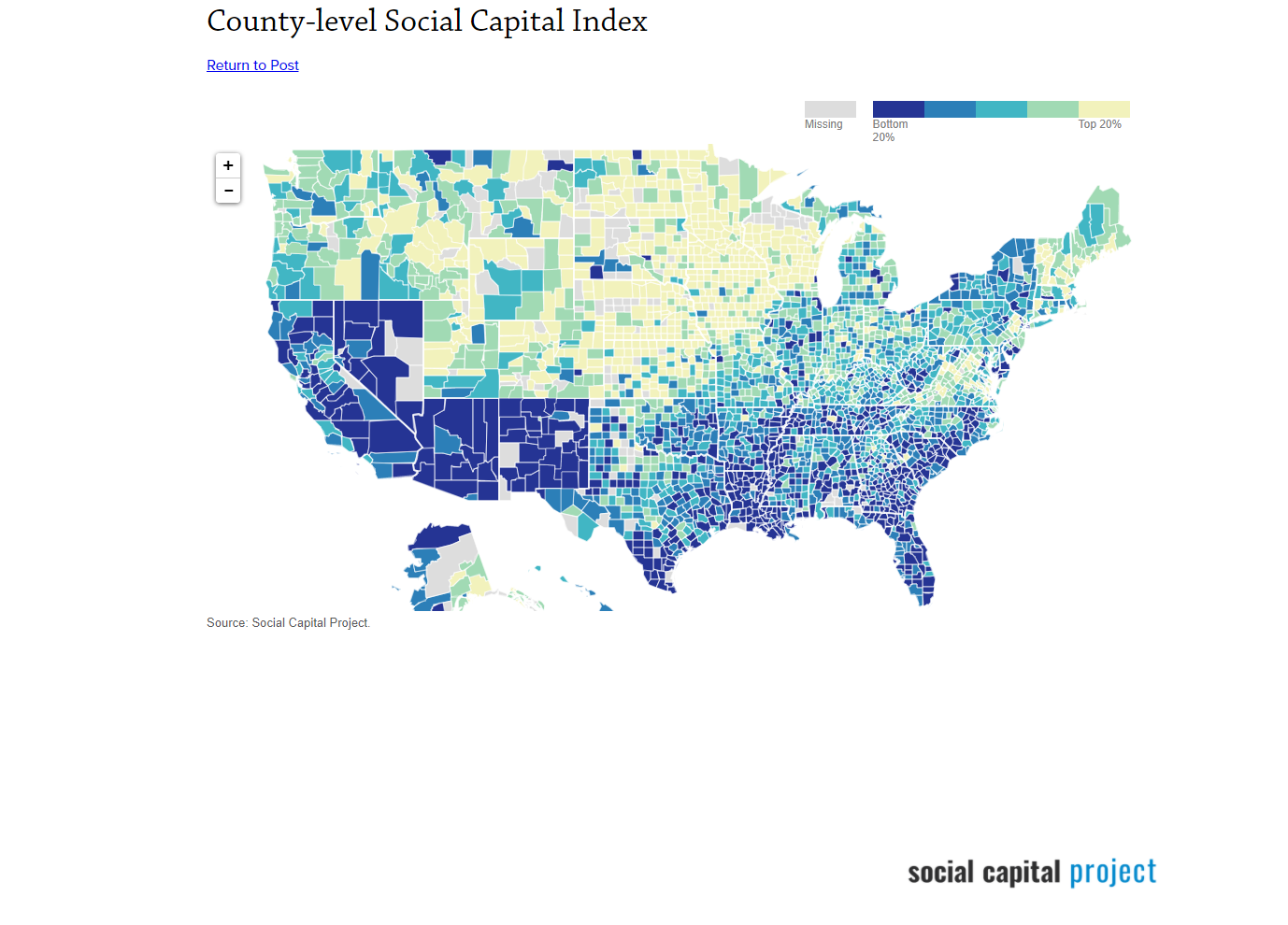
The first map is the John Hopkins Coronavirus map, and the second is the distribution of social capital across America. I was struck by how similar the chloropleth maps appeared to be.
They were not exact, but there definitely appeared to be a correlation.
There are some clear regions of demarcation within the social capital map. For example, of the 11 states with the lowest levels of social capital, 10 of them fall within a contiguous bloc of states running from Nevada, across the southwest and south through Texas over to Georgia and Florida.
Of the 12 states with the highest social capital scores, 3 of them are found in Northern New England (Maine, New Hampshire, and Vermont), as well as a second swath of states spanning the mountain west and into the plains (Utah, Colorado, Wyoming, the Dakotas and Nebraska). So while the visible correlations between the geography of American social capital and the spread of COVID-19 did not appear to be entirely consistent, they did appear to be significant, and certainly worth exploring in more detail.
Thus my curiosity was piqued, and it turns out that I was not the only one who was curious.
I spent a good part of the evening on Thursday, July 27th researching any studies or prior analysis that had been conducted on the intersection of social capital and COVID-19, and I found some incredibly interesting research done from around the world on the topic:
As the night wore on and I continued to uncover interesting research and data, I officially (at least in my mind) pivoted topics and dropped the green space & emotional health idea and decided to visualize social capital’s impact and influence on COVID-19. It all worked out in the end, as it turned out another participant developed a very nice visualization on the same topic:

IronViz 2020: Green Space in the American City by Maxwell Titsworth
I was convinced exploring the influence of Social Capital on the spread of COVID-19 was the way to go for me for several reasons:
I was familiar with both data sets. I figured this would be important considering my timeline.
The first ever data visualization I published to tableau public was using the US Senate JEC social capital data
This year I published a viz using the New York Times COVID data
I was interested to learn more about the topic
I believed it was a relevant and important topic that was worthy of being explored and amplified
There was already some great research done on the matter that I could reference and leverage
Sketching. Organizing. Outlining.
I know many people sketch out their desired visualization so that they have a tangible reference point to work towards when developing. I, however, have never made that a regular practice. I’ve preferred instead to have an over-arching objective or question that the viz is trying to explore and answer, and then produce a simple outline (much like for a speech or presentation) whose main points correspond to sections or features within the visualization, and let the details take shape on their own.
Here is an example of how I used that process when developing my IronViz:
Key Question: How might American Social Capital influence the spread of COVID-19?
Define the Terms - What is Social Capital? In my mind, this had to be the very first section of the visualization. Much like a speech, the importance of defining terms upfront cannot be overstated. Social Capital, in particular, can be somewhat of a nebulous term, so I knew it would be incredibly important to try to establish clarity directly from the outset.
Introduce the Question / Dilemma - Is Social Capital in fact related/correlated to COVID-19? After defining the terms the next thing I wanted to do was to introduce the question that the rest of the visualization would explore; namely, is there a correlation? If so, what might cause it, and why is it important?
Why is it Important? Make your Points and Persuade - How might Social Capital influence the spread of COVID-19? Much like a speech, this would be the body of the visualization. It is where the key pieces of analysis would be displayed and would lead the consumer of the visualization towards a conclusion
Close. Summarize. Reiterate & Suggest a Path Forward - What should our collective response be to Social Capitals impact on COVID-19? Again, much like a speech, the closing remarks should touch on all that’s been said before and leave the audience changed and impacted by what they have taken in. A good conclusion reminds the audience how the Key Question has been addressed and answered and how it should impact them going forward.
The Importance of Clarity
My aim with all of the above was to do it with the utmost clarity, believing that when dealing with complex topics or ideas, clarity and simplicity are far more effective communication tools than nuance and visual extravagance.
A hearty Amen from me on this tweet from Steven Shoemaker…
From Theory to Practice
Define the Terms - What is Social Capital?
Making the purpose of the visualization clear right from the start using words, visuals, sketches and contrast
The Title is arguably the most important aspect of a chart. It is what the viewer first encounters when exporing the viz. It is what they see in the tiny little thumbnail that they have to click through to get to the full visualization. It should tell the user what the entire visualization is about, possibly even posing/framing the key question. I tried to make my title in this viz stand out by using contrast and using extra large font with some shading.
Social Capital is a community asset, experienced at the city and neighborhood level. The sketch in the right-hand corner of the title attempts to communicate that concept
There have been slight variations in the ways social capital is defined, but I felt that the inclusion of language that referenced ‘trust, norms, and networks … facilitating coordinated actions.’ captured the essence of what I was exploring in the visualization, and it was important for me to define this immediately in the visualization.
The picture is purposeful and portrays individuals from across the demographic spectrum coming together, to sacrifice some of their time and serve others in a meaningful way.
Components of the JEC Social Capital Index
While the first section of the viz attempted to define Social Capital at a high level, the section directly below it, attempted to add additional granularity and decompose the Social Capital Index that would be used throughout the analysis. This decomposition was critical from my perspective because it specified for the viewer exactly what was being measured in comparison to the COVID-19 data. A ‘Tile’ based layout was used to provide insight into what was included in each sub-index that fed the overall index (shown below):

I used a ‘tile’ concept to attempt to clearly define what was included in each Social Capital sub-index as well as incorporating KPI’s to provide a comparison to national median scores.
I then wanted to allow the viewer to select a county and update the tiles shown in the section above, as well as the continuous distribution curve that plotted where each county fell when compared to the other US counties.
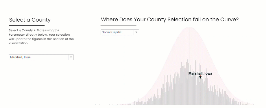
Parameters allowed the user to select a county and an index to understand the data
The credit for the methodology used to create these Gaussian Distribution Curves in Tableau goes to Toan Hoang, whose youtube tutorial allowed me to create these things incredibly easily and quickly.

The underlying calculation used to create the distribution curve
Introduce the Question / Dilemma - Is Social Capital in fact related/correlated to COVID-19?
Now that my terms were defined, it was time for me to introduce the Key Question and Dilemma; Is Social Capital correlated with COVID-19? There are various ways to view correlation, but I decided to stick with the means that initially struck me; namely comparing two county-level chloropleth maps:
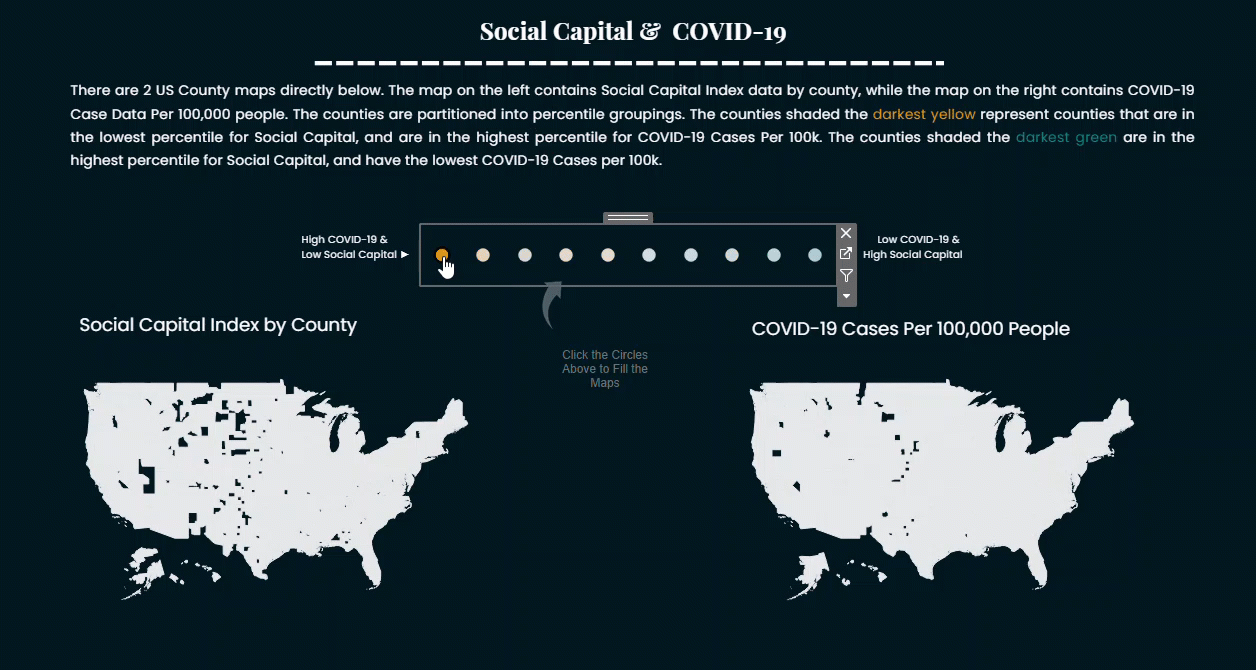
The side by side maps in my mind allowed for effective comparisons, and the interactivity introduced through the selector and set actions kept the user engaged as they explored the visualization.
I used set actions to allow a user to add values to the set and update maps.
Why is it Important? Make your Points and Persuade.
One of the main reasons why I was so fascinated by this topic, was that prior to doing any analysis or research, I had assumed that the relationship between social capital and COVID-19 would be positive (More Social Capital = More COVID). The theory being that localities that enjoyed close associational bonds and tight social networks would perpetuate the spread of a virus that was dependent on close interpersonal contact. However, as I analyzed the data I discovered what many other researchers had also discovered; namely that the other aspects of social capital, such as trust, shared norms, and commitment to the collective, in times of crisis, seemed to overshadow the deep relational contours of communities high in social capital, resulting in a negative relationship between social capital and COVID-19 (High Social Capital = Lower Prevalence of COVID-19). Researchers have theorized that these characteristics of high social capital communities have led to better adherence to the non-pharmaceutical interventions (NPI’s) that have been especially important in containing the spread of the virus. Consider the following excerpt from Stuti Rawat, and Alfred Muluan Wu in the Asia & The Pacific Policy Society:
““In the current fight against COVID-19, Sweden presents a case where social capital has contributed to behavioural compliance with health advisories.
Unlike its neighbours, the Swedish government has simply urged citizens to act responsibly and follow social distancing guidelines, rather than imposing strict rules.
Thus, schools, gyms, restaurants, and bars have remained open, and public life has been mostly unrestricted. Yet data from Citymapper, a public transit and mapping app, shows that by the end of April travel in Stockholm reduced by 70 per cent, which suggests that Swedes were choosing to comply with health advisories even though by law, they were not required to.
Sweden’s high levels of social capital can explain this.
In the latest round of the World Values Survey for 2014, over 60 per cent of respondents in Sweden agreed with the statement “most people can be trusted”. This was among the highest rates in the world and also the most stable over time.””

Cohort Analysis: Mobility comparison of the top 2 and bottom 2 county cohorts by social capital percentile
I used the apple mobility data which compared driving direction requests per capita and grouped the counties again by social capital percentile. I compared the top 2 and bottom 2 social capital cohorts and found interesting trends and associations that could be partitioned out into roughly 3-4 segments:
Pre-Pandemic - The mobility trends between all 4 cohorts seem to be roughly the same
Post-Pandemic Declaration (Mid-March - April) - The counties with high social capital appear to have fewer requests for directions than their low social capital counterparts for several weeks starting in mid-March.
Reopening - The lines radically diverge in June and July. This trend is worth exploring further, and in the viz I tried to stop short of offering up possible explanations without the requisite analysis.
Another NPI that has been used extensively throughout the pandemic was the usage of masks. In mid-July, the New York Times release a dataset featuring survey results conducted throughout the country on mask wearing when out in public.

Source: https://www.nytimes.com/interactive/2020/07/17/upshot/coronavirus-face-mask-map.html
I leveraged the data to produce perhaps my favorite section of the visualization, where I used a simple parameter action to the user to explore the survey responses:
I was really pleased with the way the coloring and segmentation by percentile, the sizing by COVID-19 cases per 100k, and the jittering allowed the dot plot to turn out, but I was really disappointed at the insufficiency of the data. I felt the data set, while promising, could have been improved in the following ways:
A more robust longitudinal sample: the data incorporated survey responses from July 2nd to July 14th, a two week period. At this point in time the geography of COVID-19 had shifted dramatically from early April, thus to be able to isolate the impact of social capital on mask-usage it would have been ideal to have survey results at several points in time throughout the spring and summer.
A larger sample size: While 250,000 responses may seem to be a lot, when you divide that number by 3,000 (the rough number of counties in the US) you get roughly 83 survey responses per county. If you assume that survey concentration was higher in counties with larger populations, it would certainly leave some counties with a sampling rate of less than 40 or 30, the approximate size needed to make inferences about the population
Even with those limitations, I believe what the visual shows is quite compelling:
Note that in the image below the largest observations (indicating high covid cases) across Social Capital percentile are almost all predominantly in the right most portion of the graph (indicating a higher percentage of mask-wearing)
Percentage of survey respondents who ‘Always’ wear a mask in public when they expect to be within 6 feet of another person.
On the other hand, when looking at respondents who answered that they ‘Rarely’ wore a mask when the expected to be within 6 feet of another person, the larger observations (indicating high COVID cases) are almost all predominantly in the left-most portion of the graph (again indicating a higher percentage of mask-wearing)
Percentage of survey respondents who ‘Rarely’ wear a mask in public when they expect to be within 6 feet of another person.
Thus, mask usage seems to be driven first and foremost by COVID-19 risk in each county. I did not have time to parse out how much of that was driven by mandatory mask policies within each county and how much of that was driven by people simply reacting to a perceived risk by implementing proven precautions (wearing a mask).
Here is how the New York Times puts it:
““Places that have experienced a lot of coronavirus, with a few exceptions, show higher-than-usual rates of masking.
The Northeast is a Democratic-leaning area, but also a place struck hard by early waves of infection.
Southern Florida and southern Texas, which tend to be more red, are suffering bad outbreaks and are now showing widespread mask use, too.””
Close. Summarize. Reiterate & Suggest a Path Forward
In the final section of the visualization I simply wanted to stress the importance of the research and why I felt this topic was important going forward.
All in all, I’m incredibly pleased with the end product and the knowledge I gained in the development of the visualization. I’m frankly amazed that I was able to squeeze this in over a 4-day span of time just barely meeting the submission deadline. Regardless of how the judging turns out I learned a lot, made some great contacts, had some fun, and created a data visualization that I am proud of. Thanks for reading!


