
Visualizing Social Isolation and Loneliness
““The cost of our detachment and disconnection is not only our isolation, our loneliness, but also the fact that there are too many people in our communities whose gifts remain on the margin.””
Robert Putnam’s book, Bowling Alone: The Collapse and Revival of American Community, is perhaps one of the most recognized and cited forays into the declining participation in American civic and social life.
I enjoyed Putnam’s book for a couple of reasons. First, the depth and breadth at which he addressed the issue of social isolation and disengagement was a testimony to the focus and importance that he placed upon the topic. This was not a passing research interest for him. It was his life’s work, and his treatment of the topic conveyed that. The book is over 400 pages, followed by about 70 pages of additional notes and appendices.
Thoroughness and quantity aside, the real value of the work lies in the fact that Putnam goes beyond where many other cultural critics and social observers are content to stop. He does not just analyze the issues and the data, but he invites the reader to confront the difficult questions with him of Why?
Why is this happening?
and Why should I care?
After having addressed those questions, Putnam then concludes the book with some historically driven thoughts and ideas of what can be done to improve the situation. His writing style is engaging and thoughtful, and he makes what could easily be a dry and academic text into something that most I believe would find accessible and engaging.
Second, the book is strewn throughout with data and graphics. The data wonk in me loves this, even if some of the graphs were challenging to read…

The chart that inspired the namesake of the book. We no longer bowl in leagues. We bowl alone.

Small Multiple Line Charts of Association Membership over Time
…or were not best practice…

Guesstimated Explanation indeed
Questionable chartsmanship aside, the impact of Bowling Alone has been significant. Since it’s writing, institutions such as Harvard have investigated similar questions. Governments have initiated projects and installed leaders and ministers to address the challenges of social isolation and loneliness.
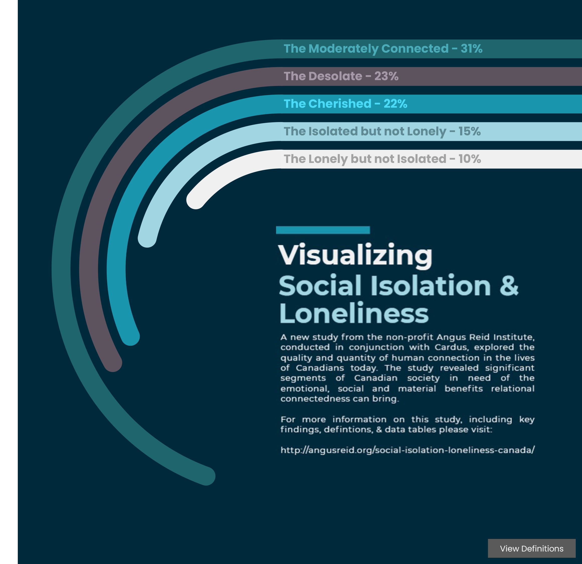
Last year, the Angus Reid institute explored the quality and quantity of human connections in the lives of Canadians. The initial chart and data from the study that I used for my visualization are shown below:

Nearly a quarter of Canadians (n = 474, 23% of the sample) fit into at least one of the “very lonely” or “very isolated” groups.
As an individual who is interested in the flourishing of his community and beyond, this data is striking and lamentable. If nearly half of the population in Canada are experiencing loneliness, isolation, and desolation, then what human potential, contributions, and vibrancy are those things choking out? What gifts and talents are going unexpressed or under-expressed because of a lack of robust social support system, and what can be done about it?
It really is a call not just for institutions and governments to mobilize and search for answers, but for individuals themselves to pursue community life in local churches, clubs, and organizations, and in so doing, pursue those among us who are in desperate need of connection.
Click the image to access on Tableau Public


