
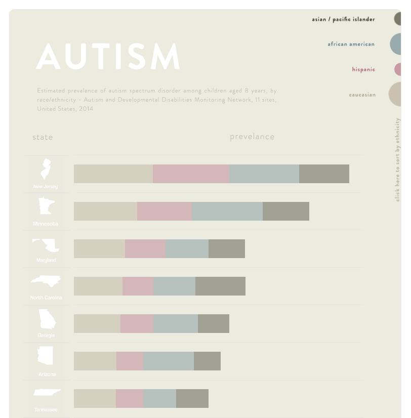
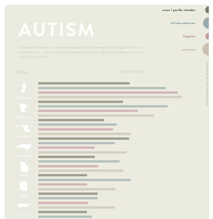
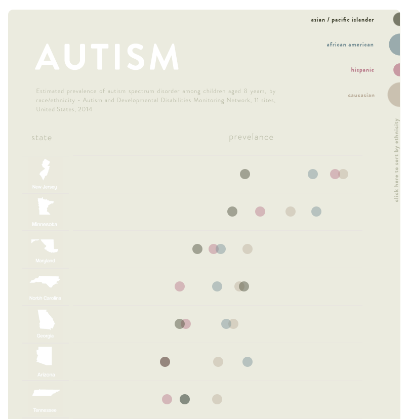
Extending the Dot Plot
The dot plot is a powerful type of visual that can be used to effectively compare values across two different dimensions. When compared to a stacked or grouped bar, the dot plot makes it easy to visualize comparisons across categories. Consider the visuals shown below using the October #ProjectHealthViz data on Autism prevalence.
Gestalt
Lindsay Betzendahl published a really interesting visualization a while back on Understanding Gestalt Principles. If you haven’t seen it, check it out. It’s a really creative way to convey some important aspects of communicating with data. The first principle in her viz is ‘Enclosure’, which states that nearly any form of visual enclosure lends itself to being perceived as grouped or related objects.
The use of enclosure surrounding the dots provides a strong signal that the observations are related. It also aids in at least a visual understanding of some basic summary statistics (variance, max, min)
Parameter Actions
Back in October, Kevin Flerlage did a great presentation to the Tucson Tableau User group on parameter actions. In developing my viz, part of the objective was to leverage some of the techniques that Kevin presented into the design and functionality of the product.
Dynamic Sorting - The usability feature that allows the user to sort the viz embodies my design objectives for the viz. The colored half circles in the upper right corner represent the overall average across states for autism prevalence, but they also serve to allow the user to sort the viz via single click. They do this while adding to the clean and modern design of the visual.
Dynamic Reference Line, Colors and Labeling - Guiding the user to a quick and easy understanding of the data has never been easier thanks to the introduction of parameter actions. The dynamic reference line, colors and labeling are all accomplished by creating a single parameter and introducing a simple parameter action.

The string parameter ‘Race’ is updated based on the user selection of Ethnicity, which updates the reference line, labels, and colors on the Overall sheet
Viz Animations
And if all of that weren’t enough, the latest alpha release by Tableau makes it possible to add yet another powerful means of visual encoding; Motion. The animation settings can be easily changed from fast, medium, or slow to allow the user to not only visualize the rankings based on the new parameter selection, but to also, and just as importantly understand how those rankings change based on the new parameter selection.
The Final Product is shown below (clicking on the .gif will take you to the visualization on tableau public):

Enclosed Cleveland Dot Plot with visual encoding enhanced using parameter actions and Viz Animations


